[RE]Start: It's Never Too Late
Team: James Pattinson, Julia Cockerham, Alex Copeman, Latreya Nelson, Eddy Nichols and Yabaewah Scott
Remote, 2022-23
Introduction
In the conceptualization of [RE]Start, a groundbreaking graphic novel seamlessly intertwined with a guided journal, our focus is on cultivating synergy across the narrative, content and brand identity. A central pillar for the foundation of our design philosophy is accessibility, catering to a diverse audience, as we want to help as many people as possible.
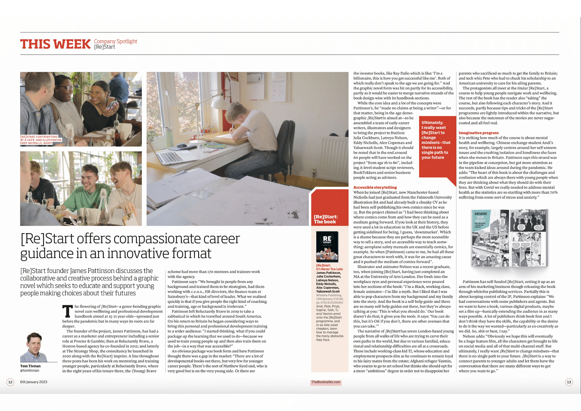
BackgroundAfter conceptualising the project, James Pattinson built, coached and led a team of over 65 people 16-60 years old to design and deliver [Re]Start: It’s Never Too Late. This project was largely inspired by his friendships over the years and experiences working at Reluctantly Brave, where he trained over 170 people 16-24yrs old to consult with senior / C-level leaders at world-class brands such as Nando’s, Starbucks and Thomson Reuters. Subsequently, he honed his brand strategy and innovation skills working with some of the world’s leading creative agencies and brands.
Illustration, Design, Branding & Identity and Publishing.
Target Audience ssssssssssssssssssssssssssssssssssssssssssssssssssssssssssssssssssssssssssssssssssss
Illustration
Focus on the age range of 16-24, the age range of those facing challenges post-COVID. However, the content should resonate with a broader demographic, emphasizing the message that it's never too late to start or restart
.
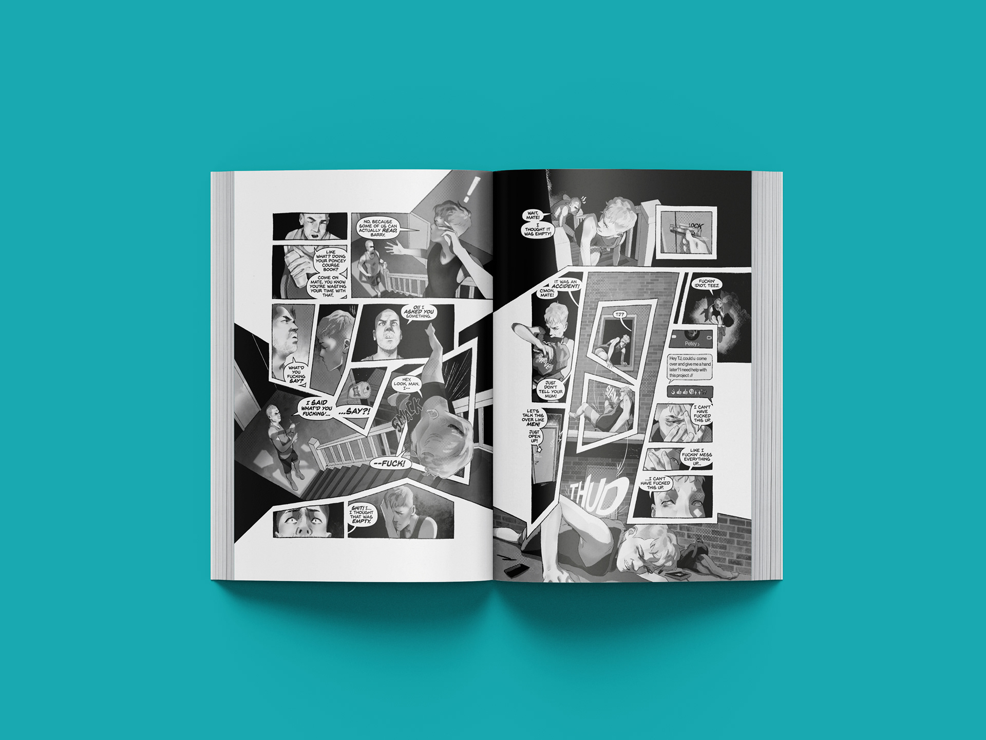
Four illustrators collaborated over a year, each separately being assigned a chapter to work on, while coming together to explore different perspectives while maintaining cohesion through visual guidelines and the black-and-white aesthetic.
Collaboration
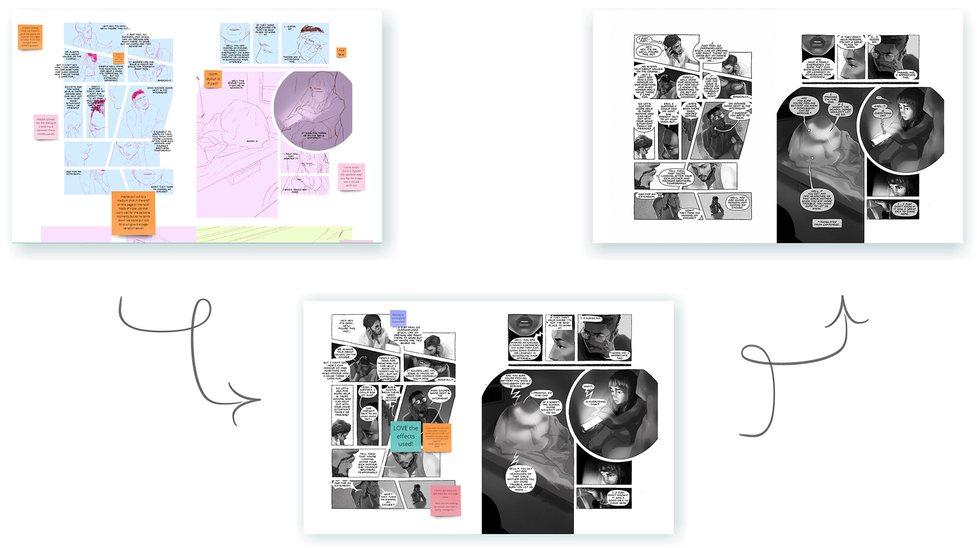
Creating this narrative remotely presented potential challenges, which was mitigated by leveraging the tools that emerged during the COVID era and maintaining a continuous flow of communication. Fortunately, the team were able to meet-up in person at the projects start, middle and end, creating robust relationships and establishing a foundation of trust.
Daily meetings were key for the illustrators, starting each day with discussions and maintaining a dedicated text chain for quick enquiries. The core team engaged in weekly critiques, showcasing the week’s progress with the primary goal of addressing and rectifying any mistakes before the weekend. In-addition, interactive whiteboards and group chats were employed to facilitate seamless communication with the broader team. This structured communication approach ensured cohesion and alignment throughout the project.
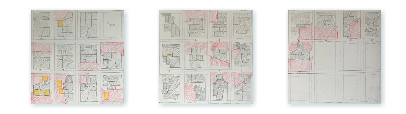
Layout
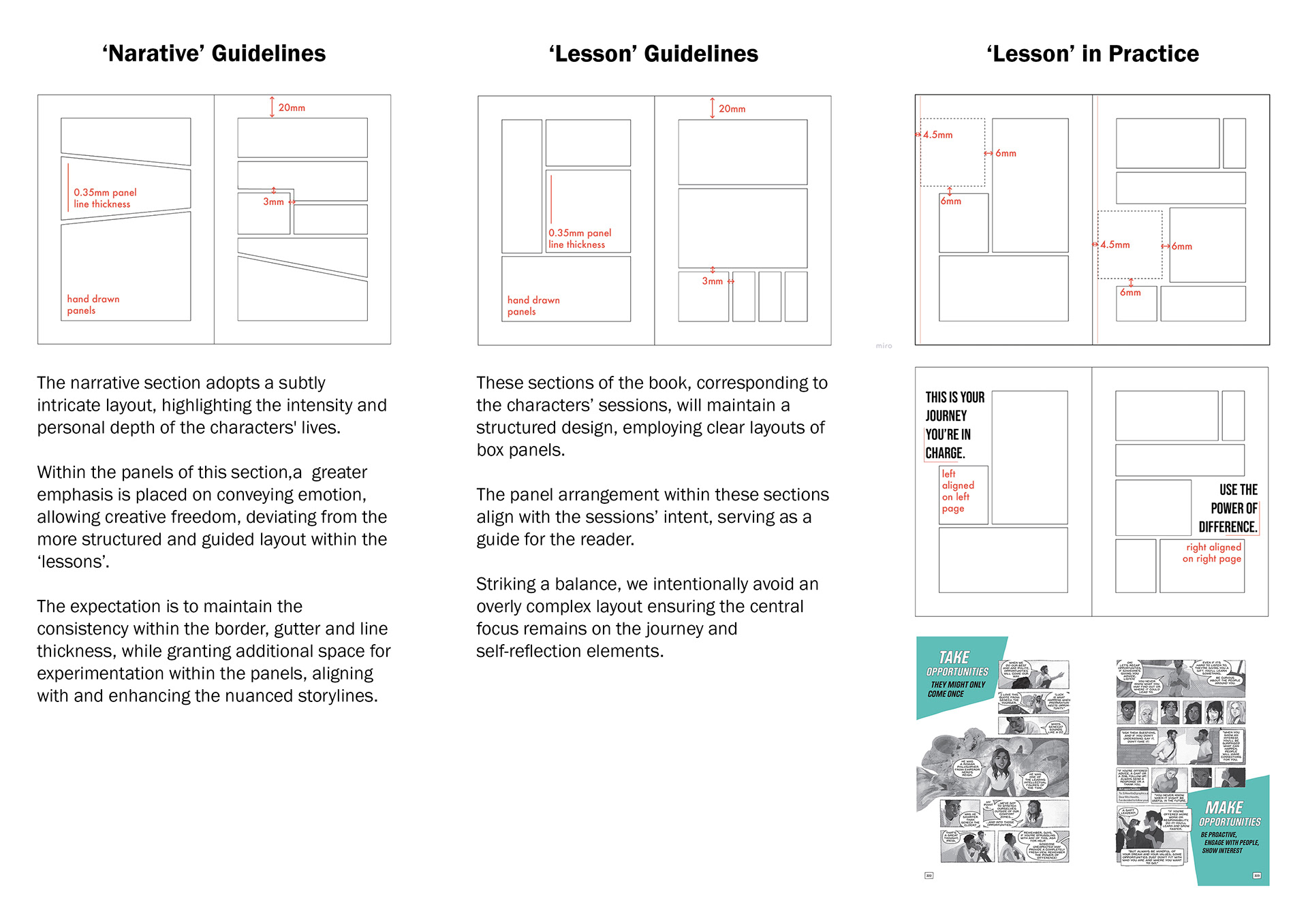
The pacing and presentation relied heavily on thoughtful page layout, with the team taking careful considerations into the gaps between panels to evoke specific tones and push the narrative rhythm. This helps to guide the readers through moments of action and contemplation while adhering to the design guidelines.
Colour Scheme
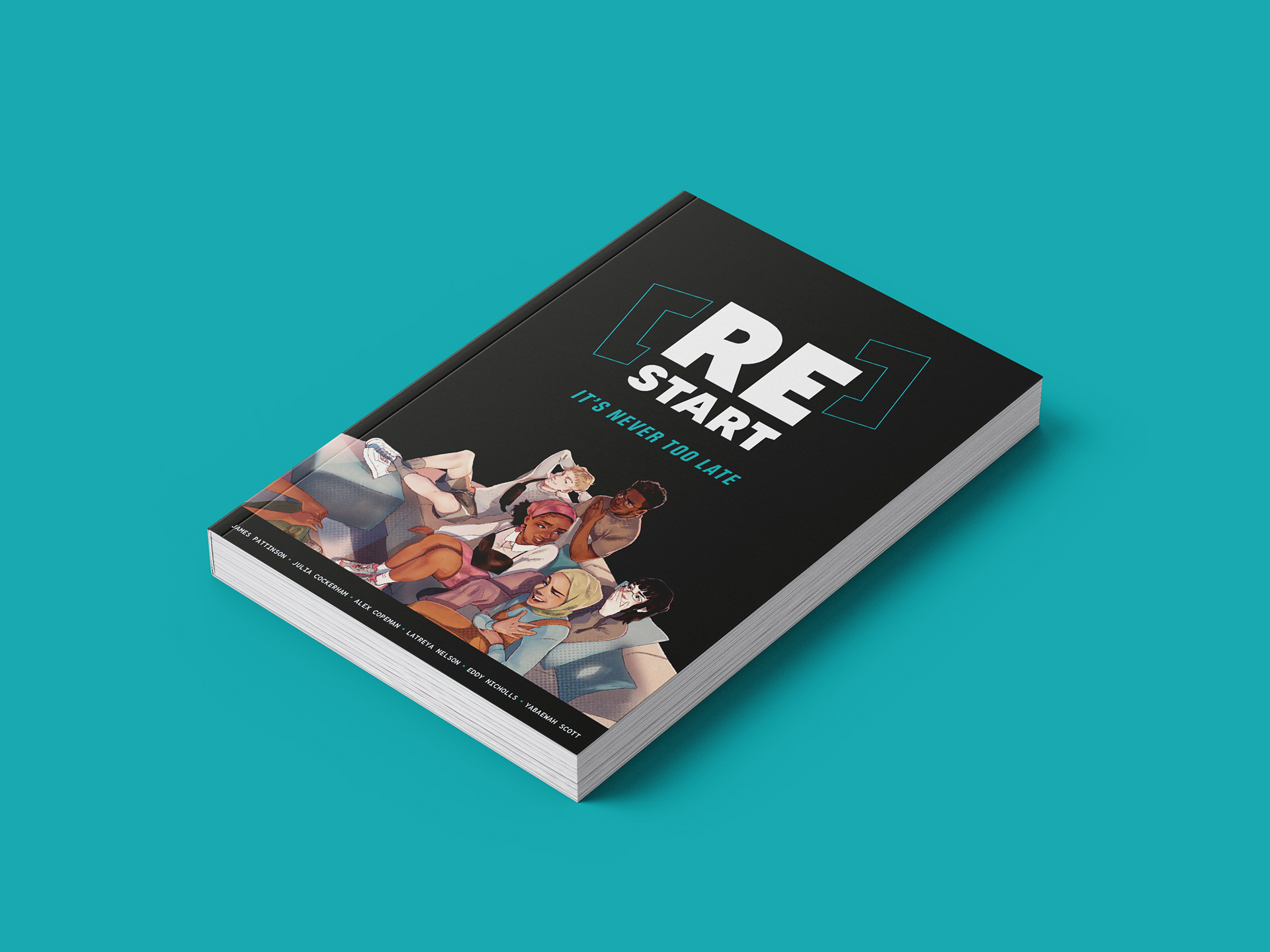
To focus on accessibility we had to balance the affordability of the final product without compromising on depth or quality, hence the decision to maintain a black-and-white palette. However due to this, branding would become an issue so we wanted to have a look at incorporating a secondary colour.
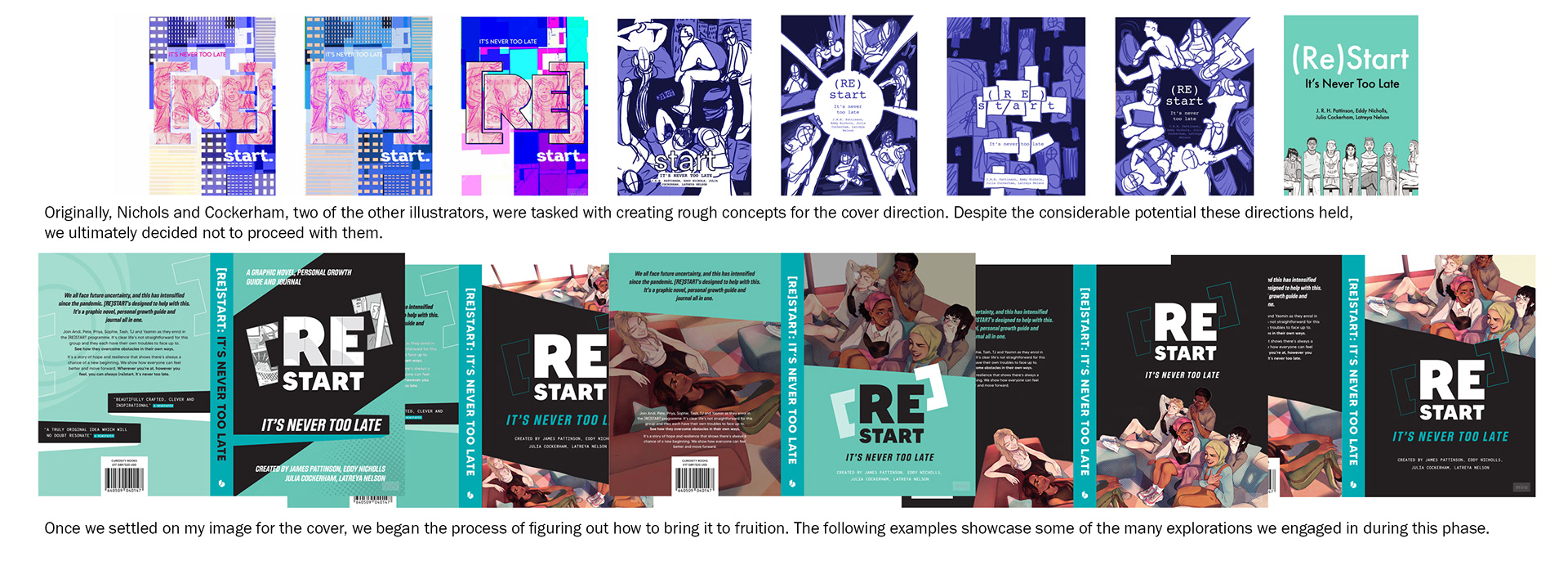
To do this, we deeply considered the tone, look and significance, going through an arrangement of iterations before landing on teal and pink. While the team at large enjoyed the visualisation of the novel using pink, this was eventually voted out, being later used on the limited edition copies covers as a nod to what could've been.
Teal was chosen, as it represents clarity of thought and revitalization, aligning with the novel's core message.
Design Guidelines
Design Elements
A cohesive approach was imperative to navigate a project with multiple creatives, so we set in place guidelines. The team adhered to a ‘bleed’ document, maintaining a 3mm gap between panels. The ‘lesson’ segments followed stricter guidelines, as we introduced more graphic elements to smoothly transition to the ‘journal’ segments.
The shift from graphic novel to journal seamlessly occurs through the incorporation of graphic elements, which are derived from panel shapes to add a familiarity to the transition. The graphic elements host prompts, titles or questions directed to both the characters and the reader. Questions posed in the ‘lesson’ segments mirror those faced by the characters, creating synergy between the narrative and the reflective journal.
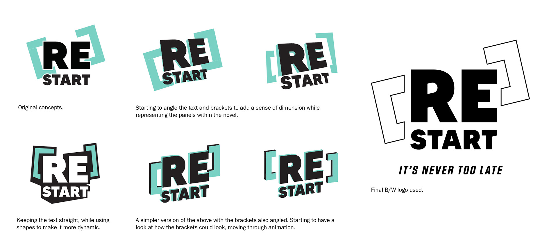
Logo Variants
The logo creation focused on versatility, ensuring compatibility with square and circular formats. Utilising the box brackets around ‘re’ to reflect the panel element throughout the book, which now works in tow with the design elements previously created. This, complimented by a bold sans-serif font for readability, creates a sleek and recognizable aesthetic that allows the art to be focused on.
Cover
Initially a low-priority aspect, the cover naturally evolved after I was commissioned to create artwork of the seven characters, initially intended for postcards and promotional prints. Upon completion, this artwork was trialed as one of our cover options and garnered unanimous approval. Despite challenges converting an image intended for a different format, we settled on a wraparound cover with carefully considered negative space, resulting in a sleek, cohesive design, highlighting the chosen teal colour.
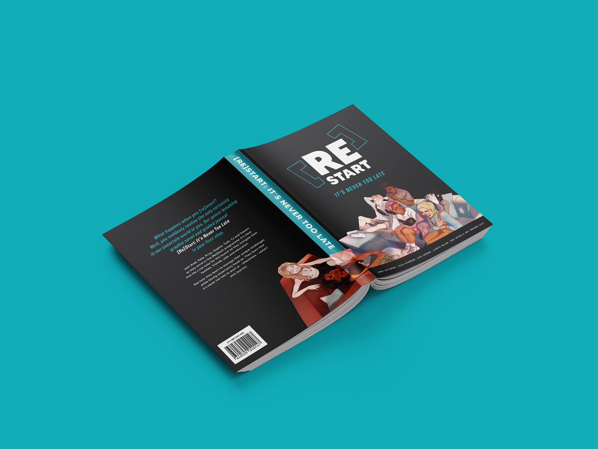
Final Cover mock-up.